


Human Computer Interaction Design Course @ UCSD
1.2014 - 3.2014
Role - User Researcher, Interaction Designer, Visual Designer
Tools - Paper & pencil, Illustrator, Photoshop, Bootstrap, HTML
Partners - Developer Groupmates
Discover the Right Problem
Needfinding & Discovery Research
My group focused our problem space on studying at our campus library. Narrowing in on an opportunity of improvement, I observed and interviewed 1st floor studiers (the social floor), 8th floor studiers (the quiet floor), and a desk employee. The common trend was that people would keep their phones visible but off to the side in case of an emergency notifications, but would constantly be tempted to check their phones when unimportant notifications caught their eye.
PROBLEM - As a student focusing on getting work done, I'm distracted with a multitude of phone notifications and want to see only necessary notifications at specific times.
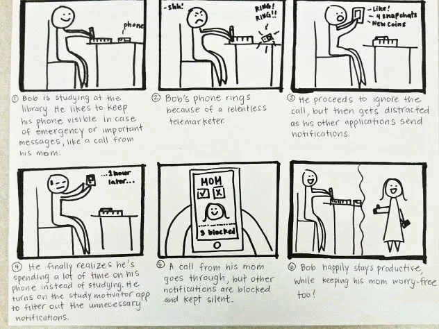
Competitive Analysis & Storyboarding
For inspiration, we researched products that our users mentioned to help them focus while studying, i.e. extensions to block social media websites, Pomodoro timers, etc. We took our insights from our research and storyboarded a scenario where a user dealt with their problem but then interacted with our initial design proposal (see drawing below).
Design the Right Solution
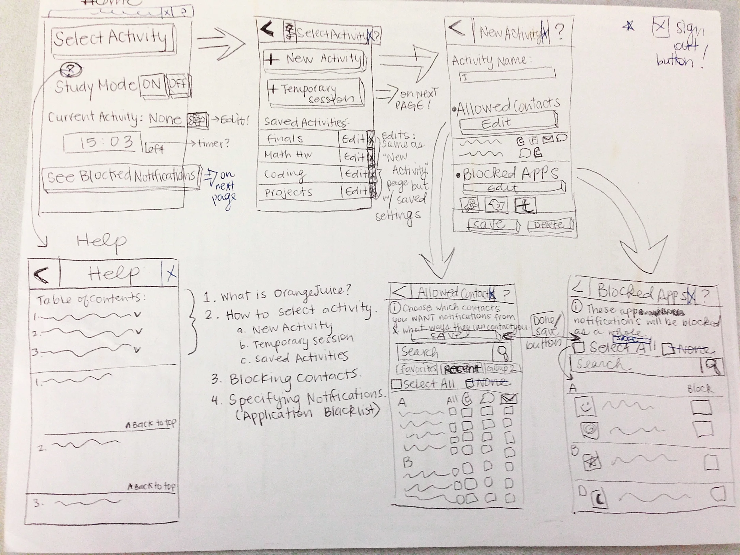
Prototyping & Usability Testing
This course practiced the "fail early, fail often" concept, in which we iterated on lo-fi paper prototypes to be tested against Heuristic Evaluations and user feedback. I sketched out each iteration of the workflow and interface of our evolving web application (as pictured below). We then used Google Analytics to implement an A/B test for the interactions of our edit activity page.

SOLUTION - Allow only the most important notifications to alert users on their phone by having them choose who and what to block; thus, creating a space that's made for 100% concentration.
Our final deliverable was a functional mobile web application that stuck to a simplistic, distraction-free interface. We presented our design solution at the end of the course with a 30 second elevator pitch for an audience of 100+ people.

Future Considerations
Beyond the constraint of a 10-week course, I would want to conduct a usability test on our last iteration to get more user-centered feedback on our concept. I'd also want to update the visual design so that it looked more polished and less like Bootstrap.